Redrawing an icon without erasing it.
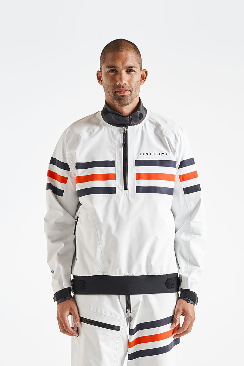
New owners, new chapter. Henri Lloyd, one of sailing's most iconic marques, needed its identity brought into the present without breaking faith with fifty years of heritage. Through Metropolis, I proposed a direction that kept the details that mattered and modernized everything else. They said yes.
Heritage is not what you keep. It is what you choose to keep.
The challenge
Redrawing a beloved logo is the most scrutinized move in branding: too timid and nothing changes, too bold and the loyalists revolt. The mark had to say new era to the market and still say Henri Lloyd to the sailor who has worn it for thirty years.
What I did
Proposed and designed the new identity: bold where the era demanded it, faithful where the heritage earned it.
Set the typographic direction: a font flirting with the wind, just bold enough to make a statement, curved for elegance, simple yet unique.
Delivered the identity into application, so the mark proved itself in the wild, not on a slide.
The brief for a heritage rebrand is never "make it new." It is "decide what was actually the heritage." Most of what people defend in an old logo is habit. The work is finding the two details that are not.
About the company
Henri Lloyd
Henri Lloyd is a British sailing and lifestyle brand founded in 1963, a pioneer of technical sailing wear, whose mark has crossed oceans on the shoulders of professionals and enthusiasts for six decades.
- Apparel and marine heritage
- Identity redesign, typography, application
- Through Metropolis
- BRANDING